" width="122px"><path d="M 118.73 46.592 C 115.401 32.368 109.037 18.044 97.935 10.489 L 97.916 10.47 C 86.833 2.1 73.22 -0.087 60.246 0.003 C 54.09 0.092 47.992 0.47 42.013 2.02 C 30.005 5.062 16.608 12.974 10.431 24.982 C 5.536 33.908 2.866 45.389 1.428 56.582 C -0.001 67.854 -0.198 78.837 0.147 88.539 C 0.462 94.831 1.576 101.133 2.699 107.564 C 3.477 112.057 3.812 116.58 5.201 121.023 C 7.259 127.484 10.707 135.218 14.253 141.39 C 15.199 142.991 15.948 144.273 16.953 145.585 C 20.243 149.8 24.173 153.408 28.685 156.181 C 37.048 161.102 45.894 163.03 54.602 163.766 C 63.34 164.392 71.929 163.835 80.706 161.221 C 93.453 157.871 104.752 147.434 111.362 134.403 C 118.267 121.331 120.483 105.676 121.695 90.825 C 122.395 75.567 122.079 61.124 118.73 46.572 Z M 77.919 143.11 L 74.589 113.906 C 73.811 108.091 72.57 104.145 70.846 102.077 C 69.122 100.01 66.551 99.195 63.113 99.642 C 62.778 102.107 62.611 104.622 62.611 107.197 C 62.611 107.197 62.936 114.542 62.236 121.958 L 62.236 121.958 C 62.236 129.005 60.434 134.293 56.828 137.822 C 53.223 141.351 48.593 143.11 42.939 143.11 C 34.398 143.11 30.133 137.911 30.133 127.504 C 30.133 114.751 30.744 104.572 31.965 96.958 L 42.939 96.958 C 39.501 105.348 37.176 111.64 35.955 115.834 C 34.733 120.029 34.122 123.359 34.122 125.824 C 34.122 128.061 34.782 129.601 36.122 130.436 C 37.452 131.271 39.727 131.699 42.939 131.699 C 45.49 131.699 47.263 131.023 48.258 129.681 C 49.253 128.339 49.755 126.441 49.755 123.975 C 49.755 119.721 48.76 114.214 46.761 107.445 C 44.761 100.676 41.826 91.978 37.944 81.352 C 34.063 70.388 31.098 61.462 29.049 54.584 C 27 47.705 25.976 42.079 25.976 37.715 C 25.976 30.896 27.946 25.747 31.876 22.278 C 35.807 18.809 40.831 17.08 46.928 17.08 C 57.685 17.08 63.064 22.278 63.064 32.686 C 63.064 43.093 62.118 54.166 60.237 66.581 L 47.598 66.581 C 51.479 59.196 54.356 52.765 56.247 47.288 C 58.128 41.811 59.074 37.556 59.074 34.534 C 59.074 32.189 58.158 30.588 56.326 29.753 C 54.494 28.918 51.361 28.491 46.928 28.491 C 43.707 28.491 41.491 29.167 40.279 30.509 C 39.058 31.851 38.447 33.759 38.447 36.214 C 38.447 41.025 39.392 46.562 41.274 52.824 C 43.155 59.086 46.042 67.257 49.923 77.327 C 51.381 81.124 52.711 84.682 53.912 88.012 C 56.572 92.952 60.276 93.608 60.276 93.608 L 74.244 20.608 L 90.872 20.608 L 90.872 31.851 L 85.553 32.855 C 83.11 33.302 81.061 34.813 79.396 37.387 C 77.731 39.962 76.293 43.292 75.072 47.367 C 73.85 51.453 72.245 57.685 70.245 66.074 C 69.467 69.762 68.915 72.227 68.58 73.46 C 67.142 79.275 66.531 81.8 66.748 81.014 C 65.191 87.724 64.197 92.207 63.753 94.443 L 65.418 94.95 L 77.229 58.202 L 90.862 58.202 L 90.862 66.929 L 87.208 67.933 C 83.553 68.937 80.834 70.428 79.061 72.376 C 77.288 74.335 75.348 77.943 73.239 83.201 C 71.023 88.569 69.634 92.485 69.082 94.95 L 70.245 95.626 L 83.553 94.115 L 91.365 143.12 L 77.899 143.12 Z" fill="rgb(0, 55, 255)" height="164px" id="aRNfPx3qP" width="122px"/></g></svg>)
" width="453.99997914273325px"><g fill="transparent" height="59.00000039330595px" id="rDV_pa2QW" width="453.99997914273325px"><path d="M 0 42.411 L 10.708 38.495 C 11.968 44.916 16.377 48.434 22.755 48.434 C 29.134 48.434 32.594 45.542 32.594 40.692 C 32.594 26.528 1.26 37.402 1.26 15.724 C 1.26 5.556 9.528 0 22.116 0 C 32.194 0 40.142 4.224 42.901 11.738 L 31.884 15.654 C 31.414 10.725 27.315 7.912 21.646 7.912 C 15.977 7.912 12.438 10.655 12.438 14.959 C 12.438 28.188 43.851 17.225 43.851 40.155 C 43.851 50.641 35.583 56.356 22.596 56.356 C 10.868 56.356 2.52 51.188 0 42.421 Z" fill="rgb(0, 55, 255)" height="56.35613202003683px" id="p1FYd5SHQ" transform="translate(0 2.584)" width="43.851307245389364px"/><path d="M 0 32.482 C 0 25.047 5.589 19.332 18.186 17.613 L 27.005 16.36 L 27.005 14.402 C 27.005 9.631 23.935 6.659 19.366 6.659 C 14.797 6.659 11.258 9.472 9.688 14.402 L 0.64 11.192 C 3.549 3.837 10.088 0 20.006 0 C 28.824 0 37.243 4.85 37.243 16.122 L 37.243 33.734 C 37.243 37.571 37.553 40.622 38.262 43.514 L 28.424 43.514 C 27.715 41.397 27.405 38.972 27.245 34.987 C 25.435 40.861 19.926 44.687 13.227 44.687 C 5.439 44.687 0 39.757 0 32.482 Z M 16.607 37.263 C 22.586 37.263 26.605 31.001 26.995 22.314 L 20.856 23.248 C 13.767 24.341 10.548 27.313 10.548 31.468 C 10.548 34.987 12.907 37.263 16.607 37.263 Z" fill="rgb(0, 55, 255)" height="44.68733142151708px" id="H4_pLd2_j" transform="translate(46.051 14.313)" width="38.262415145486784px"/><path d="M 0.01 1.173 L 10.088 1.173 L 10.088 8.607 C 11.738 3.21 16.067 0 21.976 0 C 27.884 0 32.364 3.519 33.703 9.234 C 35.203 3.598 40.002 0 46.301 0 C 54.329 0 59.448 5.795 59.448 15.028 L 59.448 43.823 L 49.29 43.823 L 49.29 15.028 C 49.29 10.019 46.931 7.127 42.911 7.127 C 37.872 7.127 34.883 11.897 34.883 19.958 L 34.883 43.823 L 24.645 43.823 L 24.645 15.028 C 24.645 10.019 22.286 7.127 18.346 7.127 C 13.227 7.127 10.238 11.897 10.238 19.958 L 10.238 43.823 L 0 43.823 L 0 1.173 Z" fill="rgb(0, 55, 255)" height="43.82260770406335px" id="c8TC0MAVb" transform="translate(88.083 14.005)" width="59.448215431163945px"/><path d="M 0 0 L 11.338 0 L 11.338 24.341 L 32.594 0 L 45.341 0 L 24.795 22.463 L 47.231 54.16 L 33.373 54.16 L 17.317 30.683 L 11.338 37.173 L 11.338 54.16 L 0 54.16 Z" fill="rgb(0, 55, 255)" height="54.15953490121143px" id="PgVDk5k3h" transform="translate(171.926 3.678)" width="47.23063735230721px"/><path d="M 0 22.145 C 0 8.995 8.348 0 20.626 0 C 32.903 0 41.252 8.995 41.252 22.145 C 41.252 35.295 32.903 44.449 20.626 44.449 C 8.348 44.449 0 35.374 0 22.145 Z M 30.224 22.065 C 30.224 12.911 26.525 7.037 20.616 7.037 C 14.707 7.037 11.008 12.911 11.008 22.065 C 11.008 31.22 14.707 37.243 20.616 37.243 C 26.525 37.243 30.224 31.369 30.224 22.065 Z" fill="rgb(0, 55, 255)" height="44.448786947736735px" id="tjVes_VRA" transform="translate(215.467 14.323)" width="41.25182254776024px"/><path d="M 0 0 L 10.238 0 L 10.238 55.8 L 0 55.8 Z" fill="rgb(0, 55, 255)" height="55.79952811417336px" id="S1nw1vPpL" transform="translate(260.808 2.038)" width="10.237970501431562px"/><path d="M 0 22.304 C 0 8.846 8.028 0 20.236 0 C 33.063 0 40.702 8.995 39.522 24.491 L 10.948 24.491 C 11.578 32.71 15.357 37.72 21.106 37.72 C 25.755 37.72 29.294 34.281 30.314 28.953 L 39.522 32.164 C 37.633 39.837 29.994 44.995 20.786 44.995 C 8.348 44.995 0 35.921 0 22.304 Z M 28.894 18.08 C 28.734 11.351 25.275 6.967 20.396 6.967 C 15.517 6.967 12.048 11.192 11.108 18.08 Z" fill="rgb(0, 55, 255)" height="44.99545136681669px" id="eUphQPWTT" transform="translate(275.135 14.005)" width="39.641652738235166px"/><path d="M 0 34.122 L 9.448 30.603 C 10.398 34.827 14.247 37.958 19.286 37.958 C 23.775 37.958 26.525 35.533 26.525 32.641 C 26.365 23.795 1.65 29.043 1.65 13.229 C 1.65 5.009 8.498 0 18.886 0 C 27.625 0 34.153 3.678 36.363 10.019 L 26.915 13.458 C 26.205 9.542 22.895 6.967 18.646 6.967 C 14.627 6.967 11.958 8.926 12.038 11.977 C 12.198 21.052 36.993 16.201 36.993 31.617 C 36.993 39.598 29.824 44.995 19.126 44.995 C 9.838 44.995 2.52 40.851 0 34.122 Z" fill="rgb(0, 55, 255)" height="44.995451366816695px" id="qPdZlsi3u" transform="translate(315.597 14.005)" width="36.992666850875594px"/><path d="M 0 0.944 L 10.238 0.944 L 10.238 9.393 C 12.368 3.678 17.716 0 24.405 0 C 32.754 0 38.262 5.715 38.262 14.71 L 38.262 43.505 L 27.874 43.505 L 27.874 16.271 C 27.874 10.397 25.115 6.958 20.396 6.958 C 14.097 6.958 10.398 12.981 10.398 23.159 L 10.398 43.505 L 0.01 43.505 L 0.01 0.944 Z" fill="rgb(0, 55, 255)" height="43.50454840568956px" id="xcD3rviwO" transform="translate(355.909 14.313)" width="38.2624151454869px"/><path d="M 0 0 L 10.548 0 L 10.548 9.86 L 0 9.86 Z M 0.08 15.257 L 10.468 15.257 L 10.468 57.827 L 0.08 57.827 Z" fill="rgb(0, 55, 255)" height="57.82715667979029px" id="t47e4mUcy" transform="translate(398.971 0)" width="10.54790906153346px"/><path d="M 0 0 L 10.238 0 L 10.238 30.444 L 26.615 13.15 L 37.633 13.15 L 22.206 29.589 L 39.522 55.809 L 27.245 55.809 L 15.357 36.945 L 10.238 42.342 L 10.238 55.8 L 0 55.8 Z" fill="rgb(0, 55, 255)" height="55.80946746724755px" id="K_Z1k1efQ" transform="translate(414.478 2.038)" width="39.52216542203013px"/></g></g></svg>)
John Stamatakis
Client
John Stamatakis
Year
2020-2026
Roles
Graphic Designer
Branding
Packaging design
Event artwork
Social assets
Web design
An ongoing creative relationship based around good hospitality, food and shared experiences.
Since 2020, I've been John Stamatakis's ongoing creative partner across three ventures: The Fig Tree, The Greek Secret and Mould Farmer.
What started as freelance design work has grown into a long-running relationship where I'm brought in from early concept through to final execution, across identity, packaging, print and digital.
The Fig Tree
Branding
Web
Social
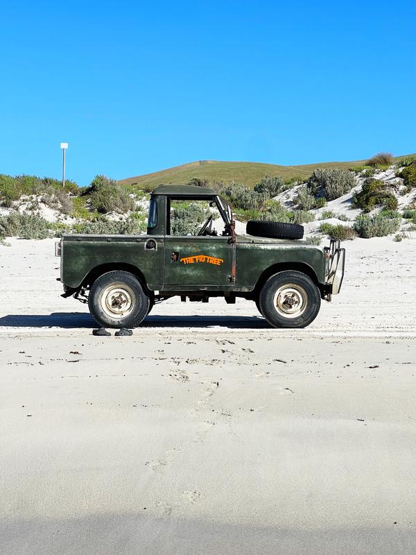
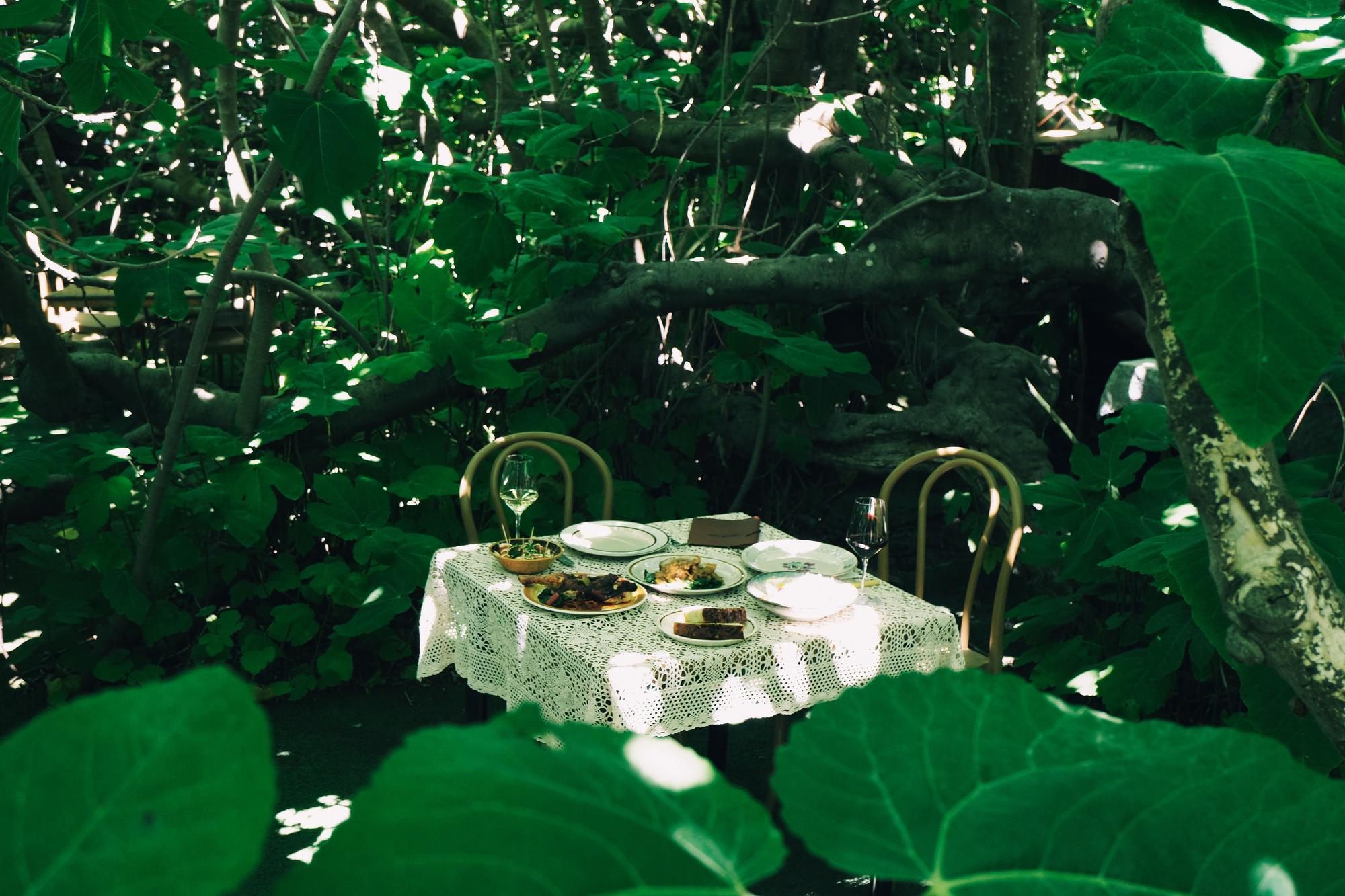
The Fig Tree is one of South Australia's most iconic dining destinations, a seasonal, open-air restaurant built into the canopy of a century-old fig tree on Kangaroo Island, serving Mediterranean-inspired food to a crowd of travellers, locals and in-the-know foodies who've heard about the magical experience of eating underneath the ancient tree.
When John took over running the venue, he inherited a site with real cultural weight on the island, but a brand that didn't reflect what the restaurant had become.
With John as the new steward of the restaurant, he was looking to update and modernise the branding to appeal to the food-literate, travel-focused clientele the restaurant wanted to continue to attract, whilst building on the Hellenistic quality of dining under the tree itself.
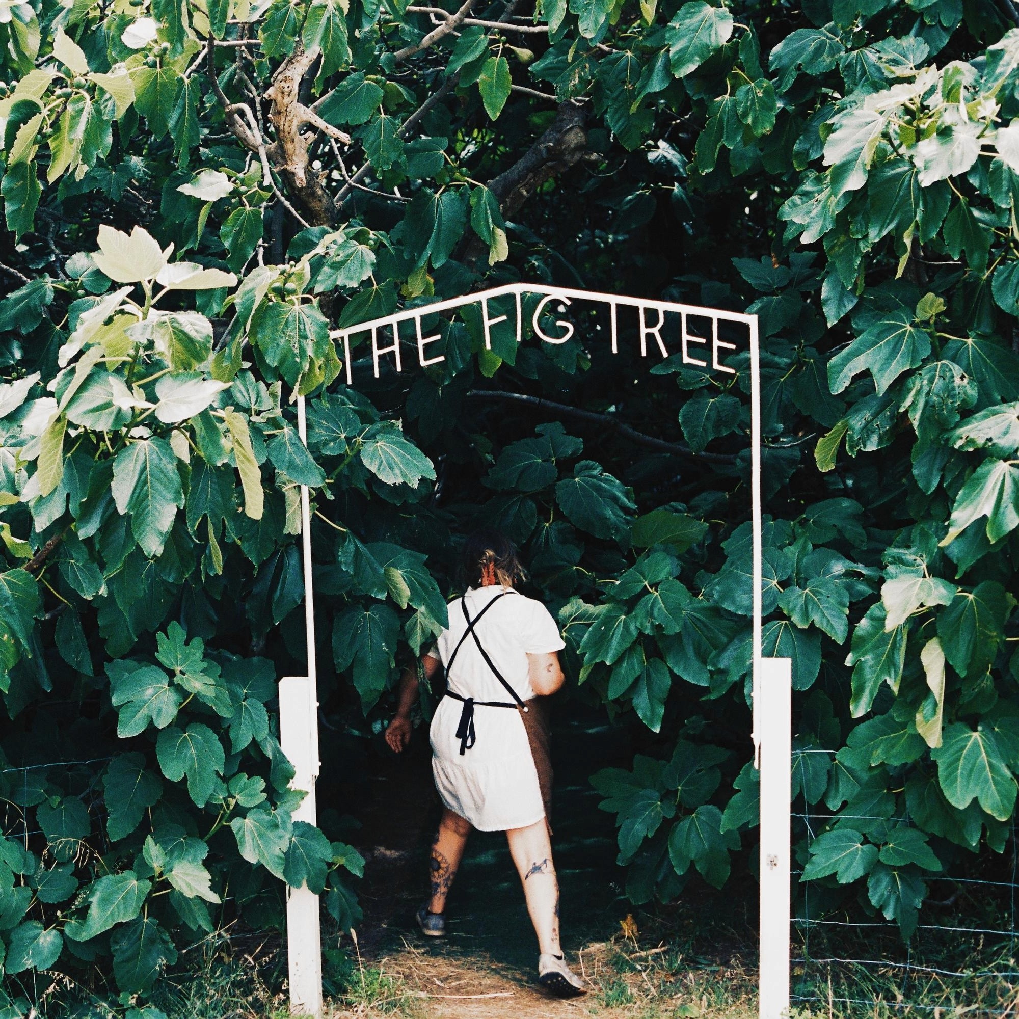
The challenge was to modernise the identity through building on the very first thing diners see when arriving to the site, the metal arch over the entrance to the tree.

This entrance is a charming arch built out of metal, with The Fig Tree name sitting underneath the arch. I built the logo directly from that structure, so the mark carries the physical heritage of the venue. From there I developed a full brand refresh: a more contemporary type and colour system, a suite of social media assets for ongoing content, and a complete rebuild of the website, with new structure, new visuals and a new copy hierarchy, built to work as hard for bookings as it does for storytelling.




La Baracca
Branding
Web
Social
La Baracca is the newest addition to The Fig Tree property; an old shearing shed reworked into a low-lit, rustic setting for a pop-up Italian dinner series, running one night a week (Wednesdays, December through April) alongside the main restaurant's season. Where The Fig Tree is the headline experience, La Baracca is deliberately smaller and more casual: snacks off the charcoal brazier, pizzas out of the wood oven, and a room full of leftover agricultural bric-a-brac.
The venue needed its own identity, distinct from The Fig Tree but clearly part of the same world. John's brief leaned into what makes the site itself distinctive: the pink peppercorn tree growing beside the shed, the pine plantation on the hill above, and a loosely Italian, playful tone. Deliverables included a primary logo, a secondary mark for the booking platform, social tiles, and a new page on The Fig Tree website, all built to grow into signage down the line.
I built the identity around a badge mark in the spirit of a vintage Italian product label, centred on a hand-illustrated pink peppercorn branch in place of the floral motif John had originally referenced.
Rather than illustrating briscola cards directly, that reference shaped the badge itself, sized and proportioned to double as an actual drink coaster on the tables. The wordmark pairs a script "La" with a bolder, more compressed "Baracca", run in two colourways; a red, green and gold label version for print and menus, and a stripped-back cream and black version for hero brand moments.
The whole system sits on a colour palette lifted from Kangaroo Island's sunsets, dusky purple fading into orange and gold, which sets La Baracca apart from The Fig Tree's palette while still feeling like it belongs on the same site. That system now runs across the set menu, the campaign tiles announcing the season, and social content.


The Greek Secret
Branding
Social
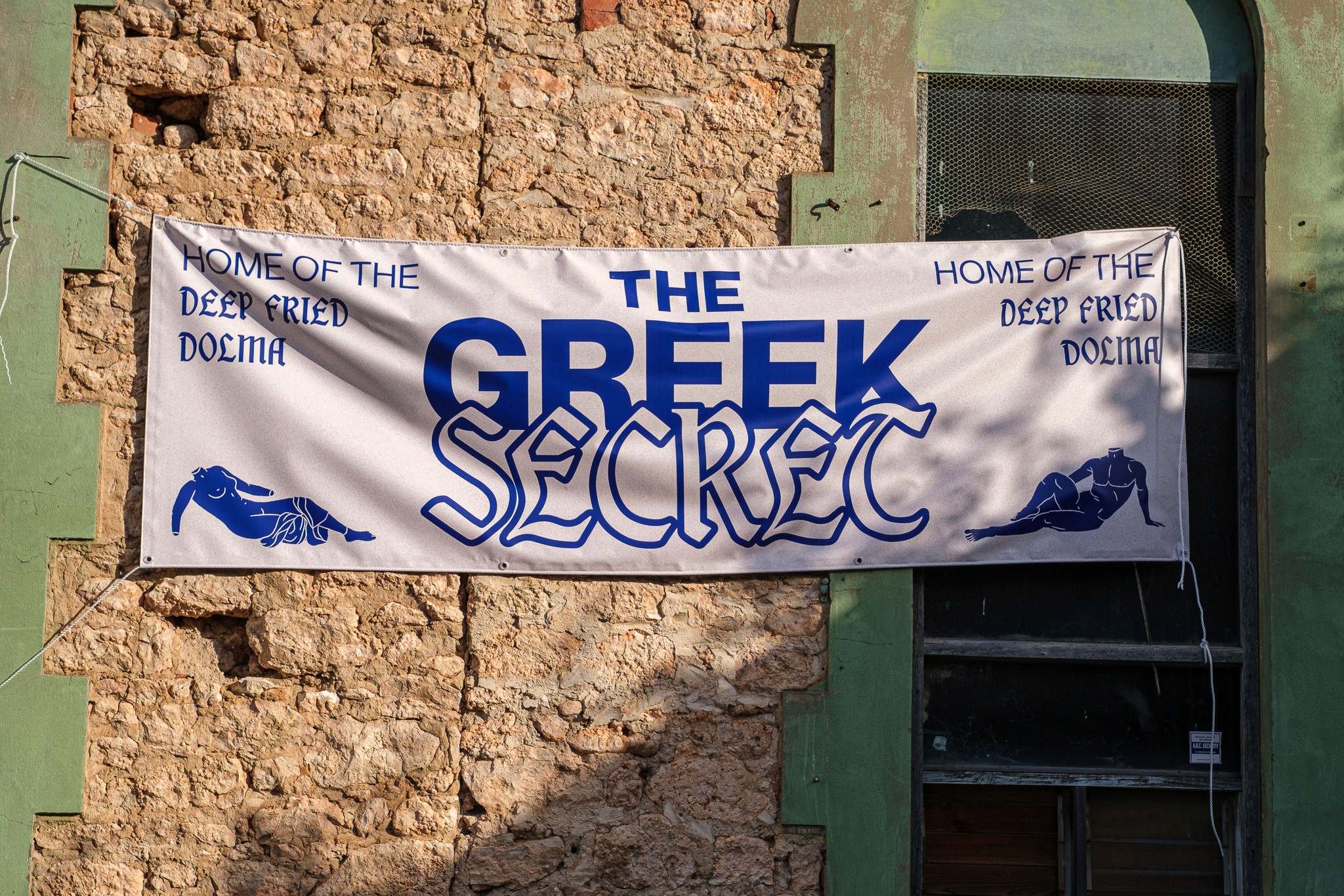
The Greek Secret is one of John's pop-up dinners, run at Oddio, a wine bar and cellar door. John came to the brief with a clear creative direction already forming in his head; something he could deploy fast and simply, built around the idea of Ancient, Mysterious, Delicious.
John's brief leaned heavily on ancient Greek visual language: red and black figure pottery, marble busts with that intense, moody stare, temple columns, mythological figures like Zeus and Dionysus, and even the owl from the old drachma coin.
I worked from that reference pool to build the promo campaign, on-site signage and menu, weaving in Greek phrases (Oriste!, Parakalo!, Efharisto!) as part of the voice, and steering the imagery toward something that felt fun and vibrant.


Mould Farmer
Branding
Packaging
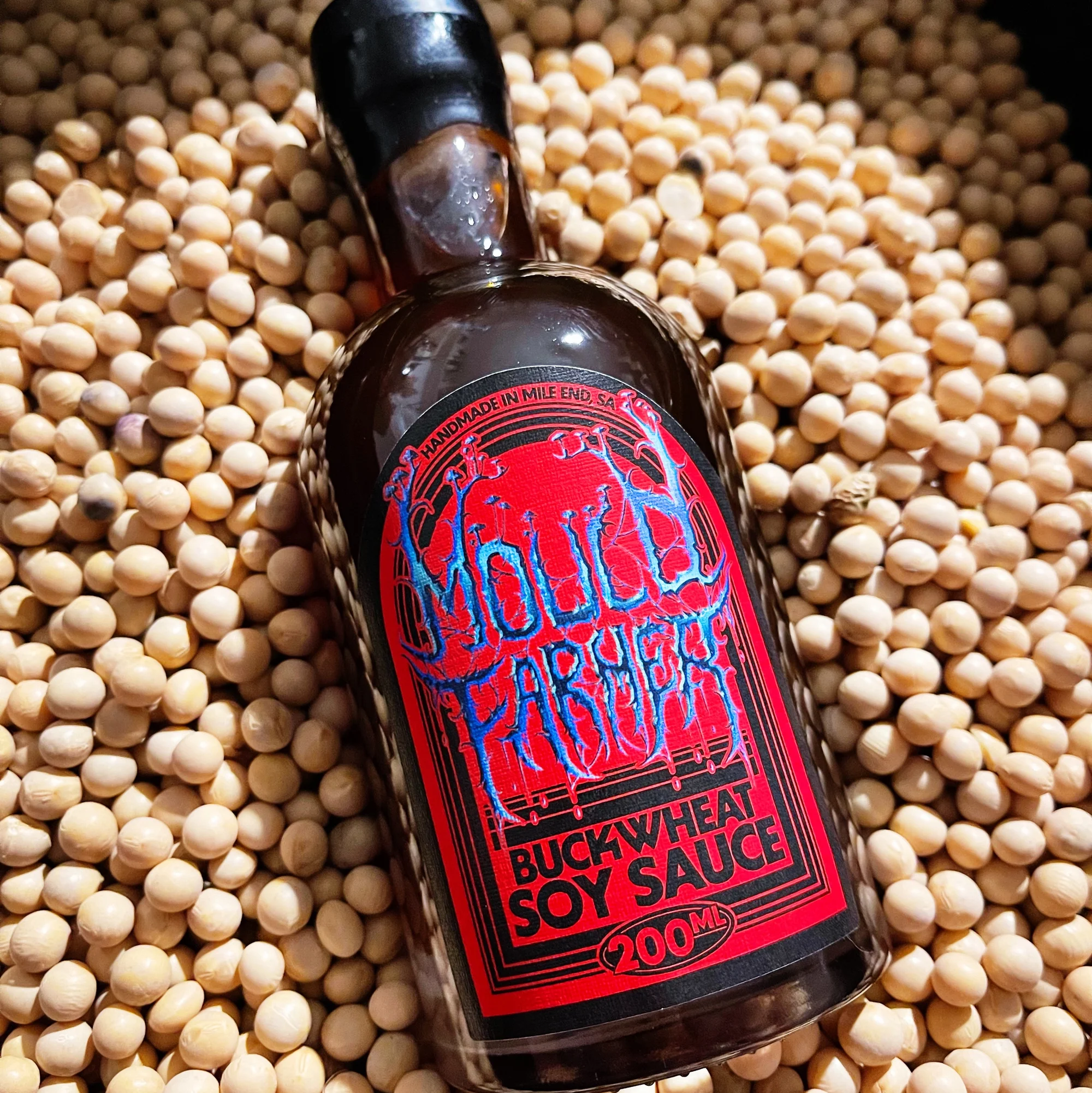
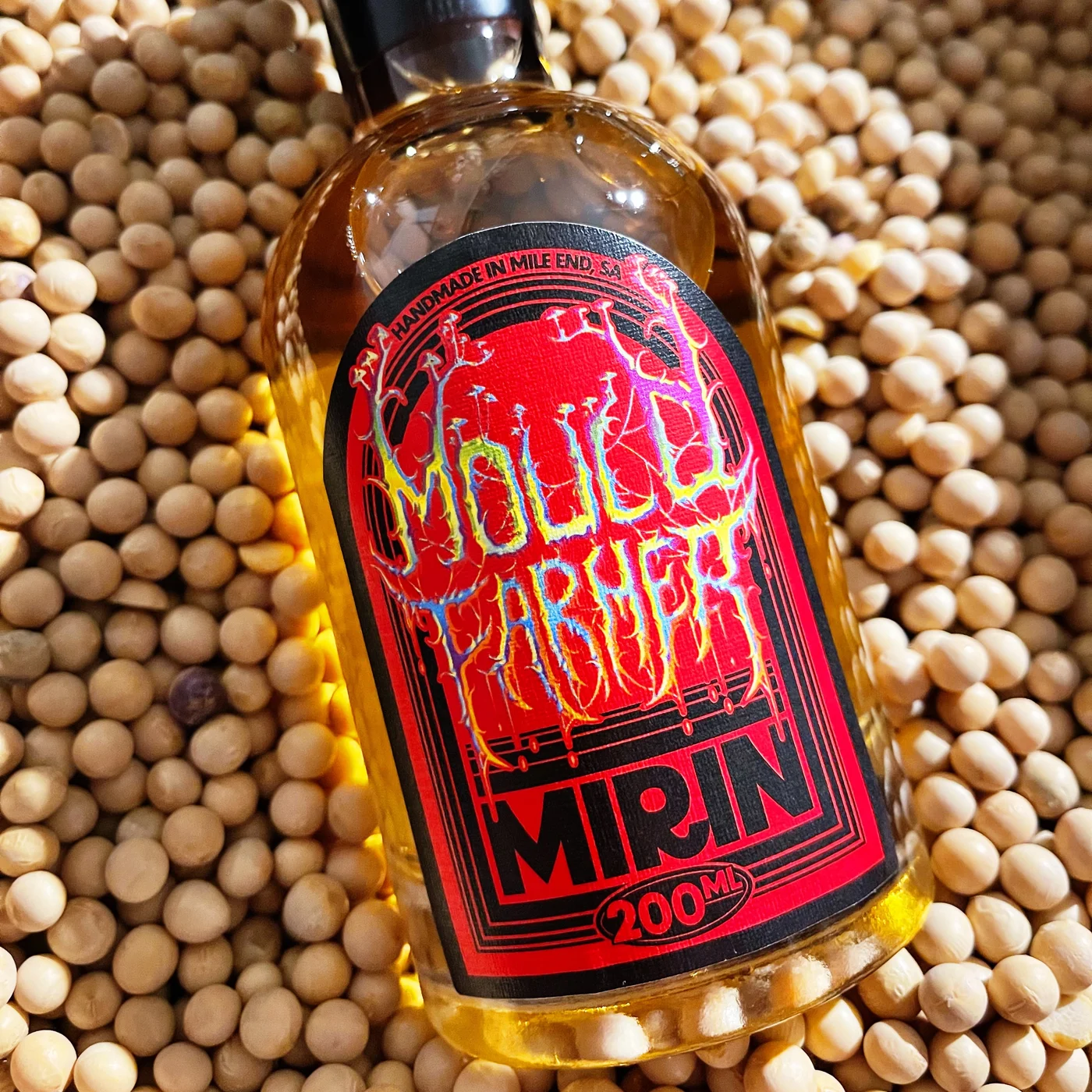
Mould Farmer is John's fermentation business: koji, shoyu, mirin and other fermented products, sold as standalone goods rather than restaurant-only ingredients. It was the first project I worked on with John, and effectively where our design relationship began.
As a new product line, Mould Farmer needed an identity and packaging system built from scratch, something that could sit on a shelf or in a gift box and make a fairly unfamiliar category of product (fermented condiments) feel credible.
But even writing that sounds boring. We did the opposite.
We made it dark, bold, and as loud as it could go.
With John providing the metal inspired logo, I built the core brand identity, then extended it into a packaging label system designed to work as a consistent family across the different bottle and jar formats the product range grew into.